665 lines
19 KiB
Rust
665 lines
19 KiB
Rust
//! Checkboxes can be used to let users make binary choices.
|
|
//!
|
|
//! # Example
|
|
//! ```no_run
|
|
//! # mod iced { pub mod widget { pub use iced_widget::*; } pub use iced_widget::Renderer; pub use iced_widget::core::*; }
|
|
//! # pub type Element<'a, Message> = iced_widget::core::Element<'a, Message, iced_widget::Theme, iced_widget::Renderer>;
|
|
//! #
|
|
//! use iced::widget::checkbox;
|
|
//!
|
|
//! struct State {
|
|
//! is_checked: bool,
|
|
//! }
|
|
//!
|
|
//! enum Message {
|
|
//! CheckboxToggled(bool),
|
|
//! }
|
|
//!
|
|
//! fn view(state: &State) -> Element<'_, Message> {
|
|
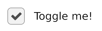
//! checkbox("Toggle me!", state.is_checked)
|
|
//! .on_toggle(Message::CheckboxToggled)
|
|
//! .into()
|
|
//! }
|
|
//!
|
|
//! fn update(state: &mut State, message: Message) {
|
|
//! match message {
|
|
//! Message::CheckboxToggled(is_checked) => {
|
|
//! state.is_checked = is_checked;
|
|
//! }
|
|
//! }
|
|
//! }
|
|
//! ```
|
|
//! 
|
|
use crate::core::alignment;
|
|
use crate::core::layout;
|
|
use crate::core::mouse;
|
|
use crate::core::renderer;
|
|
use crate::core::text;
|
|
use crate::core::theme::palette;
|
|
use crate::core::touch;
|
|
use crate::core::widget;
|
|
use crate::core::widget::tree::{self, Tree};
|
|
use crate::core::window;
|
|
use crate::core::{
|
|
Background, Border, Clipboard, Color, Element, Event, Layout, Length,
|
|
Pixels, Rectangle, Shell, Size, Theme, Widget,
|
|
};
|
|
|
|
/// A box that can be checked.
|
|
///
|
|
/// # Example
|
|
/// ```no_run
|
|
/// # mod iced { pub mod widget { pub use iced_widget::*; } pub use iced_widget::Renderer; pub use iced_widget::core::*; }
|
|
/// # pub type Element<'a, Message> = iced_widget::core::Element<'a, Message, iced_widget::Theme, iced_widget::Renderer>;
|
|
/// #
|
|
/// use iced::widget::checkbox;
|
|
///
|
|
/// struct State {
|
|
/// is_checked: bool,
|
|
/// }
|
|
///
|
|
/// enum Message {
|
|
/// CheckboxToggled(bool),
|
|
/// }
|
|
///
|
|
/// fn view(state: &State) -> Element<'_, Message> {
|
|
/// checkbox("Toggle me!", state.is_checked)
|
|
/// .on_toggle(Message::CheckboxToggled)
|
|
/// .into()
|
|
/// }
|
|
///
|
|
/// fn update(state: &mut State, message: Message) {
|
|
/// match message {
|
|
/// Message::CheckboxToggled(is_checked) => {
|
|
/// state.is_checked = is_checked;
|
|
/// }
|
|
/// }
|
|
/// }
|
|
/// ```
|
|
/// 
|
|
#[allow(missing_debug_implementations)]
|
|
pub struct Checkbox<
|
|
'a,
|
|
Message,
|
|
Theme = crate::Theme,
|
|
Renderer = crate::Renderer,
|
|
> where
|
|
Renderer: text::Renderer,
|
|
Theme: Catalog,
|
|
{
|
|
is_checked: bool,
|
|
on_toggle: Option<Box<dyn Fn(bool) -> Message + 'a>>,
|
|
label: String,
|
|
width: Length,
|
|
size: f32,
|
|
spacing: f32,
|
|
text_size: Option<Pixels>,
|
|
text_line_height: text::LineHeight,
|
|
text_shaping: text::Shaping,
|
|
text_wrapping: text::Wrapping,
|
|
font: Option<Renderer::Font>,
|
|
icon: Icon<Renderer::Font>,
|
|
class: Theme::Class<'a>,
|
|
last_status: Option<Status>,
|
|
}
|
|
|
|
impl<'a, Message, Theme, Renderer> Checkbox<'a, Message, Theme, Renderer>
|
|
where
|
|
Renderer: text::Renderer,
|
|
Theme: Catalog,
|
|
{
|
|
/// The default size of a [`Checkbox`].
|
|
const DEFAULT_SIZE: f32 = 16.0;
|
|
|
|
/// The default spacing of a [`Checkbox`].
|
|
const DEFAULT_SPACING: f32 = 8.0;
|
|
|
|
/// Creates a new [`Checkbox`].
|
|
///
|
|
/// It expects:
|
|
/// * the label of the [`Checkbox`]
|
|
/// * a boolean describing whether the [`Checkbox`] is checked or not
|
|
pub fn new(label: impl Into<String>, is_checked: bool) -> Self {
|
|
Checkbox {
|
|
is_checked,
|
|
on_toggle: None,
|
|
label: label.into(),
|
|
width: Length::Shrink,
|
|
size: Self::DEFAULT_SIZE,
|
|
spacing: Self::DEFAULT_SPACING,
|
|
text_size: None,
|
|
text_line_height: text::LineHeight::default(),
|
|
text_shaping: text::Shaping::default(),
|
|
text_wrapping: text::Wrapping::default(),
|
|
font: None,
|
|
icon: Icon {
|
|
font: Renderer::ICON_FONT,
|
|
code_point: Renderer::CHECKMARK_ICON,
|
|
size: None,
|
|
line_height: text::LineHeight::default(),
|
|
shaping: text::Shaping::Basic,
|
|
},
|
|
class: Theme::default(),
|
|
last_status: None,
|
|
}
|
|
}
|
|
|
|
/// Sets the function that will be called when the [`Checkbox`] is toggled.
|
|
/// It will receive the new state of the [`Checkbox`] and must produce a
|
|
/// `Message`.
|
|
///
|
|
/// Unless `on_toggle` is called, the [`Checkbox`] will be disabled.
|
|
pub fn on_toggle<F>(mut self, f: F) -> Self
|
|
where
|
|
F: 'a + Fn(bool) -> Message,
|
|
{
|
|
self.on_toggle = Some(Box::new(f));
|
|
self
|
|
}
|
|
|
|
/// Sets the function that will be called when the [`Checkbox`] is toggled,
|
|
/// if `Some`.
|
|
///
|
|
/// If `None`, the checkbox will be disabled.
|
|
pub fn on_toggle_maybe<F>(mut self, f: Option<F>) -> Self
|
|
where
|
|
F: Fn(bool) -> Message + 'a,
|
|
{
|
|
self.on_toggle = f.map(|f| Box::new(f) as _);
|
|
self
|
|
}
|
|
|
|
/// Sets the size of the [`Checkbox`].
|
|
pub fn size(mut self, size: impl Into<Pixels>) -> Self {
|
|
self.size = size.into().0;
|
|
self
|
|
}
|
|
|
|
/// Sets the width of the [`Checkbox`].
|
|
pub fn width(mut self, width: impl Into<Length>) -> Self {
|
|
self.width = width.into();
|
|
self
|
|
}
|
|
|
|
/// Sets the spacing between the [`Checkbox`] and the text.
|
|
pub fn spacing(mut self, spacing: impl Into<Pixels>) -> Self {
|
|
self.spacing = spacing.into().0;
|
|
self
|
|
}
|
|
|
|
/// Sets the text size of the [`Checkbox`].
|
|
pub fn text_size(mut self, text_size: impl Into<Pixels>) -> Self {
|
|
self.text_size = Some(text_size.into());
|
|
self
|
|
}
|
|
|
|
/// Sets the text [`text::LineHeight`] of the [`Checkbox`].
|
|
pub fn text_line_height(
|
|
mut self,
|
|
line_height: impl Into<text::LineHeight>,
|
|
) -> Self {
|
|
self.text_line_height = line_height.into();
|
|
self
|
|
}
|
|
|
|
/// Sets the [`text::Shaping`] strategy of the [`Checkbox`].
|
|
pub fn text_shaping(mut self, shaping: text::Shaping) -> Self {
|
|
self.text_shaping = shaping;
|
|
self
|
|
}
|
|
|
|
/// Sets the [`text::Wrapping`] strategy of the [`Checkbox`].
|
|
pub fn text_wrapping(mut self, wrapping: text::Wrapping) -> Self {
|
|
self.text_wrapping = wrapping;
|
|
self
|
|
}
|
|
|
|
/// Sets the [`Renderer::Font`] of the text of the [`Checkbox`].
|
|
///
|
|
/// [`Renderer::Font`]: crate::core::text::Renderer
|
|
pub fn font(mut self, font: impl Into<Renderer::Font>) -> Self {
|
|
self.font = Some(font.into());
|
|
self
|
|
}
|
|
|
|
/// Sets the [`Icon`] of the [`Checkbox`].
|
|
pub fn icon(mut self, icon: Icon<Renderer::Font>) -> Self {
|
|
self.icon = icon;
|
|
self
|
|
}
|
|
|
|
/// Sets the style of the [`Checkbox`].
|
|
#[must_use]
|
|
pub fn style(mut self, style: impl Fn(&Theme, Status) -> Style + 'a) -> Self
|
|
where
|
|
Theme::Class<'a>: From<StyleFn<'a, Theme>>,
|
|
{
|
|
self.class = (Box::new(style) as StyleFn<'a, Theme>).into();
|
|
self
|
|
}
|
|
|
|
/// Sets the style class of the [`Checkbox`].
|
|
#[cfg(feature = "advanced")]
|
|
#[must_use]
|
|
pub fn class(mut self, class: impl Into<Theme::Class<'a>>) -> Self {
|
|
self.class = class.into();
|
|
self
|
|
}
|
|
}
|
|
|
|
impl<Message, Theme, Renderer> Widget<Message, Theme, Renderer>
|
|
for Checkbox<'_, Message, Theme, Renderer>
|
|
where
|
|
Renderer: text::Renderer,
|
|
Theme: Catalog,
|
|
{
|
|
fn tag(&self) -> tree::Tag {
|
|
tree::Tag::of::<widget::text::State<Renderer::Paragraph>>()
|
|
}
|
|
|
|
fn state(&self) -> tree::State {
|
|
tree::State::new(widget::text::State::<Renderer::Paragraph>::default())
|
|
}
|
|
|
|
fn size(&self) -> Size<Length> {
|
|
Size {
|
|
width: self.width,
|
|
height: Length::Shrink,
|
|
}
|
|
}
|
|
|
|
fn layout(
|
|
&self,
|
|
tree: &mut Tree,
|
|
renderer: &Renderer,
|
|
limits: &layout::Limits,
|
|
) -> layout::Node {
|
|
layout::next_to_each_other(
|
|
&limits.width(self.width),
|
|
self.spacing,
|
|
|_| layout::Node::new(Size::new(self.size, self.size)),
|
|
|limits| {
|
|
let state = tree
|
|
.state
|
|
.downcast_mut::<widget::text::State<Renderer::Paragraph>>();
|
|
|
|
widget::text::layout(
|
|
state,
|
|
renderer,
|
|
limits,
|
|
self.width,
|
|
Length::Shrink,
|
|
&self.label,
|
|
self.text_line_height,
|
|
self.text_size,
|
|
self.font,
|
|
alignment::Horizontal::Left,
|
|
alignment::Vertical::Top,
|
|
self.text_shaping,
|
|
self.text_wrapping,
|
|
)
|
|
},
|
|
)
|
|
}
|
|
|
|
fn update(
|
|
&mut self,
|
|
_tree: &mut Tree,
|
|
event: Event,
|
|
layout: Layout<'_>,
|
|
cursor: mouse::Cursor,
|
|
_renderer: &Renderer,
|
|
_clipboard: &mut dyn Clipboard,
|
|
shell: &mut Shell<'_, Message>,
|
|
_viewport: &Rectangle,
|
|
) {
|
|
match event {
|
|
Event::Mouse(mouse::Event::ButtonPressed(mouse::Button::Left))
|
|
| Event::Touch(touch::Event::FingerPressed { .. }) => {
|
|
let mouse_over = cursor.is_over(layout.bounds());
|
|
|
|
if mouse_over {
|
|
if let Some(on_toggle) = &self.on_toggle {
|
|
shell.publish((on_toggle)(!self.is_checked));
|
|
shell.capture_event();
|
|
}
|
|
}
|
|
}
|
|
_ => {}
|
|
}
|
|
|
|
let current_status = {
|
|
let is_mouse_over = cursor.is_over(layout.bounds());
|
|
let is_disabled = self.on_toggle.is_none();
|
|
let is_checked = self.is_checked;
|
|
|
|
if is_disabled {
|
|
Status::Disabled { is_checked }
|
|
} else if is_mouse_over {
|
|
Status::Hovered { is_checked }
|
|
} else {
|
|
Status::Active { is_checked }
|
|
}
|
|
};
|
|
|
|
if let Event::Window(window::Event::RedrawRequested(_now)) = event {
|
|
self.last_status = Some(current_status);
|
|
} else if self
|
|
.last_status
|
|
.is_some_and(|status| status != current_status)
|
|
{
|
|
shell.request_redraw();
|
|
}
|
|
}
|
|
|
|
fn mouse_interaction(
|
|
&self,
|
|
_tree: &Tree,
|
|
layout: Layout<'_>,
|
|
cursor: mouse::Cursor,
|
|
_viewport: &Rectangle,
|
|
_renderer: &Renderer,
|
|
) -> mouse::Interaction {
|
|
if cursor.is_over(layout.bounds()) && self.on_toggle.is_some() {
|
|
mouse::Interaction::Pointer
|
|
} else {
|
|
mouse::Interaction::default()
|
|
}
|
|
}
|
|
|
|
fn draw(
|
|
&self,
|
|
tree: &Tree,
|
|
renderer: &mut Renderer,
|
|
theme: &Theme,
|
|
defaults: &renderer::Style,
|
|
layout: Layout<'_>,
|
|
_cursor: mouse::Cursor,
|
|
viewport: &Rectangle,
|
|
) {
|
|
let mut children = layout.children();
|
|
|
|
let style = theme.style(
|
|
&self.class,
|
|
self.last_status.unwrap_or(Status::Disabled {
|
|
is_checked: self.is_checked,
|
|
}),
|
|
);
|
|
|
|
{
|
|
let layout = children.next().unwrap();
|
|
let bounds = layout.bounds();
|
|
|
|
renderer.fill_quad(
|
|
renderer::Quad {
|
|
bounds,
|
|
border: style.border,
|
|
..renderer::Quad::default()
|
|
},
|
|
style.background,
|
|
);
|
|
|
|
let Icon {
|
|
font,
|
|
code_point,
|
|
size,
|
|
line_height,
|
|
shaping,
|
|
} = &self.icon;
|
|
let size = size.unwrap_or(Pixels(bounds.height * 0.7));
|
|
|
|
if self.is_checked {
|
|
renderer.fill_text(
|
|
text::Text {
|
|
content: code_point.to_string(),
|
|
font: *font,
|
|
size,
|
|
line_height: *line_height,
|
|
bounds: bounds.size(),
|
|
horizontal_alignment: alignment::Horizontal::Center,
|
|
vertical_alignment: alignment::Vertical::Center,
|
|
shaping: *shaping,
|
|
wrapping: text::Wrapping::default(),
|
|
},
|
|
bounds.center(),
|
|
style.icon_color,
|
|
*viewport,
|
|
);
|
|
}
|
|
}
|
|
|
|
{
|
|
let label_layout = children.next().unwrap();
|
|
let state: &widget::text::State<Renderer::Paragraph> =
|
|
tree.state.downcast_ref();
|
|
|
|
crate::text::draw(
|
|
renderer,
|
|
defaults,
|
|
label_layout,
|
|
state.0.raw(),
|
|
crate::text::Style {
|
|
color: style.text_color,
|
|
},
|
|
viewport,
|
|
);
|
|
}
|
|
}
|
|
}
|
|
|
|
impl<'a, Message, Theme, Renderer> From<Checkbox<'a, Message, Theme, Renderer>>
|
|
for Element<'a, Message, Theme, Renderer>
|
|
where
|
|
Message: 'a,
|
|
Theme: 'a + Catalog,
|
|
Renderer: 'a + text::Renderer,
|
|
{
|
|
fn from(
|
|
checkbox: Checkbox<'a, Message, Theme, Renderer>,
|
|
) -> Element<'a, Message, Theme, Renderer> {
|
|
Element::new(checkbox)
|
|
}
|
|
}
|
|
|
|
/// The icon in a [`Checkbox`].
|
|
#[derive(Debug, Clone, PartialEq)]
|
|
pub struct Icon<Font> {
|
|
/// Font that will be used to display the `code_point`,
|
|
pub font: Font,
|
|
/// The unicode code point that will be used as the icon.
|
|
pub code_point: char,
|
|
/// Font size of the content.
|
|
pub size: Option<Pixels>,
|
|
/// The line height of the icon.
|
|
pub line_height: text::LineHeight,
|
|
/// The shaping strategy of the icon.
|
|
pub shaping: text::Shaping,
|
|
}
|
|
|
|
/// The possible status of a [`Checkbox`].
|
|
#[derive(Debug, Clone, Copy, PartialEq, Eq)]
|
|
pub enum Status {
|
|
/// The [`Checkbox`] can be interacted with.
|
|
Active {
|
|
/// Indicates if the [`Checkbox`] is currently checked.
|
|
is_checked: bool,
|
|
},
|
|
/// The [`Checkbox`] can be interacted with and it is being hovered.
|
|
Hovered {
|
|
/// Indicates if the [`Checkbox`] is currently checked.
|
|
is_checked: bool,
|
|
},
|
|
/// The [`Checkbox`] cannot be interacted with.
|
|
Disabled {
|
|
/// Indicates if the [`Checkbox`] is currently checked.
|
|
is_checked: bool,
|
|
},
|
|
}
|
|
|
|
/// The style of a checkbox.
|
|
#[derive(Debug, Clone, Copy, PartialEq)]
|
|
pub struct Style {
|
|
/// The [`Background`] of the checkbox.
|
|
pub background: Background,
|
|
/// The icon [`Color`] of the checkbox.
|
|
pub icon_color: Color,
|
|
/// The [`Border`] of the checkbox.
|
|
pub border: Border,
|
|
/// The text [`Color`] of the checkbox.
|
|
pub text_color: Option<Color>,
|
|
}
|
|
|
|
/// The theme catalog of a [`Checkbox`].
|
|
pub trait Catalog: Sized {
|
|
/// The item class of the [`Catalog`].
|
|
type Class<'a>;
|
|
|
|
/// The default class produced by the [`Catalog`].
|
|
fn default<'a>() -> Self::Class<'a>;
|
|
|
|
/// The [`Style`] of a class with the given status.
|
|
fn style(&self, class: &Self::Class<'_>, status: Status) -> Style;
|
|
}
|
|
|
|
/// A styling function for a [`Checkbox`].
|
|
///
|
|
/// This is just a boxed closure: `Fn(&Theme, Status) -> Style`.
|
|
pub type StyleFn<'a, Theme> = Box<dyn Fn(&Theme, Status) -> Style + 'a>;
|
|
|
|
impl Catalog for Theme {
|
|
type Class<'a> = StyleFn<'a, Self>;
|
|
|
|
fn default<'a>() -> Self::Class<'a> {
|
|
Box::new(primary)
|
|
}
|
|
|
|
fn style(&self, class: &Self::Class<'_>, status: Status) -> Style {
|
|
class(self, status)
|
|
}
|
|
}
|
|
|
|
/// A primary checkbox; denoting a main toggle.
|
|
pub fn primary(theme: &Theme, status: Status) -> Style {
|
|
let palette = theme.extended_palette();
|
|
|
|
match status {
|
|
Status::Active { is_checked } => styled(
|
|
palette.primary.strong.text,
|
|
palette.background.base,
|
|
palette.primary.strong,
|
|
is_checked,
|
|
),
|
|
Status::Hovered { is_checked } => styled(
|
|
palette.primary.strong.text,
|
|
palette.background.weak,
|
|
palette.primary.base,
|
|
is_checked,
|
|
),
|
|
Status::Disabled { is_checked } => styled(
|
|
palette.primary.strong.text,
|
|
palette.background.weak,
|
|
palette.background.strong,
|
|
is_checked,
|
|
),
|
|
}
|
|
}
|
|
|
|
/// A secondary checkbox; denoting a complementary toggle.
|
|
pub fn secondary(theme: &Theme, status: Status) -> Style {
|
|
let palette = theme.extended_palette();
|
|
|
|
match status {
|
|
Status::Active { is_checked } => styled(
|
|
palette.background.base.text,
|
|
palette.background.base,
|
|
palette.background.strong,
|
|
is_checked,
|
|
),
|
|
Status::Hovered { is_checked } => styled(
|
|
palette.background.base.text,
|
|
palette.background.weak,
|
|
palette.background.strong,
|
|
is_checked,
|
|
),
|
|
Status::Disabled { is_checked } => styled(
|
|
palette.background.strong.color,
|
|
palette.background.weak,
|
|
palette.background.weak,
|
|
is_checked,
|
|
),
|
|
}
|
|
}
|
|
|
|
/// A success checkbox; denoting a positive toggle.
|
|
pub fn success(theme: &Theme, status: Status) -> Style {
|
|
let palette = theme.extended_palette();
|
|
|
|
match status {
|
|
Status::Active { is_checked } => styled(
|
|
palette.success.base.text,
|
|
palette.background.base,
|
|
palette.success.base,
|
|
is_checked,
|
|
),
|
|
Status::Hovered { is_checked } => styled(
|
|
palette.success.base.text,
|
|
palette.background.weak,
|
|
palette.success.base,
|
|
is_checked,
|
|
),
|
|
Status::Disabled { is_checked } => styled(
|
|
palette.success.base.text,
|
|
palette.background.weak,
|
|
palette.success.weak,
|
|
is_checked,
|
|
),
|
|
}
|
|
}
|
|
|
|
/// A danger checkbox; denoting a negative toggle.
|
|
pub fn danger(theme: &Theme, status: Status) -> Style {
|
|
let palette = theme.extended_palette();
|
|
|
|
match status {
|
|
Status::Active { is_checked } => styled(
|
|
palette.danger.base.text,
|
|
palette.background.base,
|
|
palette.danger.base,
|
|
is_checked,
|
|
),
|
|
Status::Hovered { is_checked } => styled(
|
|
palette.danger.base.text,
|
|
palette.background.weak,
|
|
palette.danger.base,
|
|
is_checked,
|
|
),
|
|
Status::Disabled { is_checked } => styled(
|
|
palette.danger.base.text,
|
|
palette.background.weak,
|
|
palette.danger.weak,
|
|
is_checked,
|
|
),
|
|
}
|
|
}
|
|
|
|
fn styled(
|
|
icon_color: Color,
|
|
base: palette::Pair,
|
|
accent: palette::Pair,
|
|
is_checked: bool,
|
|
) -> Style {
|
|
Style {
|
|
background: Background::Color(if is_checked {
|
|
accent.color
|
|
} else {
|
|
base.color
|
|
}),
|
|
icon_color,
|
|
border: Border {
|
|
radius: 2.0.into(),
|
|
width: 1.0,
|
|
color: accent.color,
|
|
},
|
|
text_color: None,
|
|
}
|
|
}
|